
Imagine for a second that you meet a fellow business owner at a local networking event. You exchange pleasantries, ask about each other’s companies, and hand one another a business card. In addition to the card, they also give you a brochure and a direct mail piece. You genuinely enjoyed the conversation and got a good vibe from them, but as you each turn and go your separate ways, you notice a major color inconsistency in the items they gave you. For instance, their logo appears to be a different shade of blue on each item. Clearly, it is a minor detail—most people likely wouldn’t notice. But you did, and if even a handful of others do too, those inconsistent colors could weaken brand recognition and make a business appear less professional.
If you have thought this way a time or two, you are not wrong. Statistics consistently show that brand consistency matters more than many business owners realize—not just among fellow entrepreneurs but also current and potential clients, vendors, investors, and anyone else you may come across regularly in the business world. In fact, it can be argued that most consumers are more likely to recall a brand with a consistent visual identity.
That does not necessarily mean said brand has the best color scheme or flashiest logo. Who wins that award is truly in the eye of the beholder. It simply means they’ve taken the time and done a good job of presenting themselves consistently across every touchpoint.
According to HubSpot’s research on color psychology, color can increase brand awareness and recognition by up to 80%, and shapes as much as 90% of a customer’s first impression of a brand.
What Is Color Consistency in Branding?
Color consistency in branding means using the exact same colors—across business cards, signage, packaging, and digital platforms—every time. It’s one of the simplest ways to build recognition and trust with customers.
Color consistency is best defined as a company’s ability to maintain stable, predictable colors across different materials, production batches, and environments. In terms of printed materials, it means the exact same colors in the logo emblazoned on your work shirt match the colors used for the logo on your sales catalog, business cards, brochures, etc. The funny thing with color consistency is that you know how consistent it is when you don’t notice it.
We have all been in that position where there are three slightly different shades of red or green in an image. The differences are practically imperceptible, but if you or someone else can see visual differences, the design is not as cohesive as it could be. The same is true for typography, spacing, imagery, and other visual elements that help define a brand. If there are subtle differences, you may not always be able to tell exactly what feels off, but you do notice when something appears inconsistent.
That is why successful brands work hard to establish clear standards for their colors and other design elements. The goal is to create a unified visual identity that customers recognize instantly, regardless of how they encounter it.
Companies that maintain consistent branding across every channel and touchpoint can see revenue climb by as much as 33%, according to Marq’s (formerly Lucidpress) State of Brand Consistency report.
Consider All the Places Someone Can Encounter Your Brand
- Brochures
- Sales Flyers
- Manuals
- Website
- Social Media platforms
- Vehicle wraps
- Business Cards
- Catalogs
- Direct Mail & Postcards
- Media Kits
- Trade Show Banners
- Wearables
- Promotional Products

6 Reasons Why Color Consistency Matters for Brand Recognition
Color consistency is the building block of several major aspects of successful branding.
- Building brand recognition and stronger recall — In today’s business world, it is crucial that you make it easy for current and prospective customers to instantly recognize your brand. When you do, they will not only recognize you quickly, but they will often think of you first. This is why brands such as Coca-Cola, Ford, McDonald’s, and even Apple continue to thrive today. They do not settle for anything less than ensuring that customers naturally associate specific colors with their companies, whether they see them online, in print, or elsewhere.
- Establishing trust — Color consistency signals reliability. In the customer’s eyes, you are organized, dependable, and committed to quality—even when they haven’t necessarily done business with you yet. Conversely, inconsistent brand colors create uncertainty and make people question your attention to detail.
- Reinforce professionalism — Companies and the owners behind them who stress the importance of a cohesive visual identity prove quickly that they can be taken seriously. Color consistency in this regard creates a polished presence that leaves a stronger and lasting impression on customers, prospects, and business partners.
- Enhancing customer loyalty — According to a Forbes article, “color consistency enhances customer loyalty by fostering an emotional connection between the brand and its audiences. This connection increases the chances of customers remaining loyal to your brand even as competitors enter the field. In addition, branding consistency supports the management of customer expectations by delivering a certain level of quality and customer experience at every touchpoint.”
- Improving the customer experience — It is no secret that your customers find you across numerous platforms and formats. Consistent colors make that process seamless. They know they are engaging with the same trusted business, whether they are visiting your website, picking up a brochure, or watching a YouTube video.
- Less effective marketing — Consistent colors help customers instantly identify your brand. When branding varies from piece to piece, some of that recognition is lost, reducing the overall impact of your marketing efforts.
According to a Forbes article, “color consistency enhances customer loyalty by fostering an emotional connection between the brand and its audiences. This connection increases the chances of customers remaining loyal to your brand even as competitors enter the field. In addition, branding consistency supports the management of customer expectations by delivering a certain level of quality and customer experience at every touchpoint.”
Why Colors Often Look Different in Print vs Online
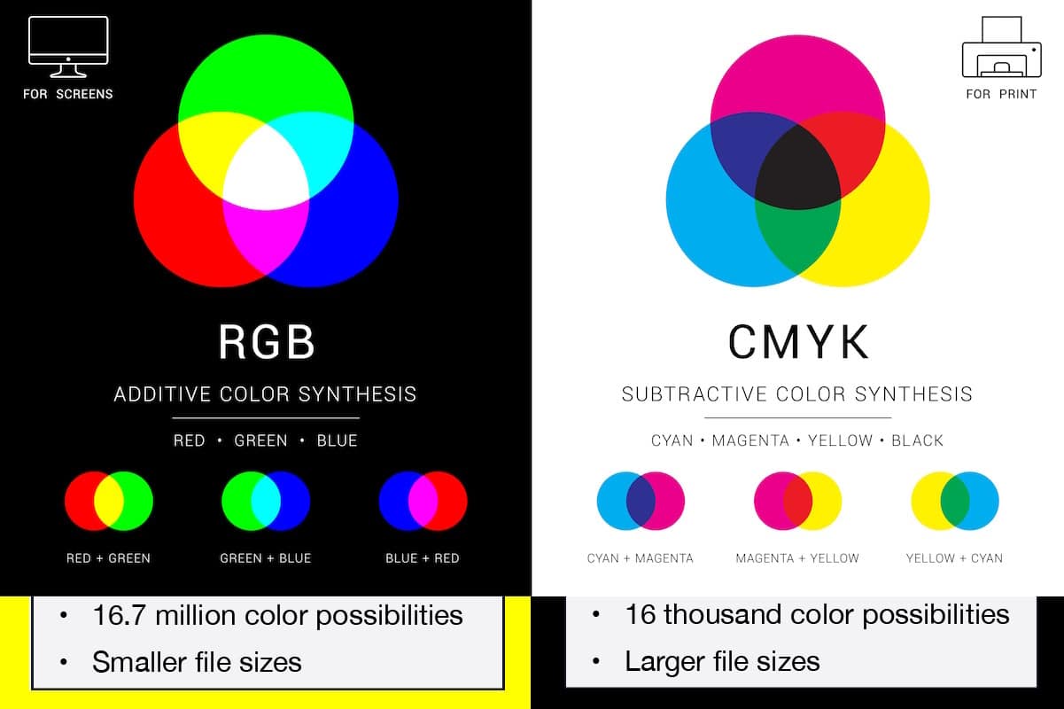
One of the biggest reasons colors appear inconsistent is that printed materials and digital materials use entirely different color models. For instance, print shops always use CMYK color printing for any project design that will be physically printed. CMYK stands for the colors cyan, magenta, yellow, and black. The CMYK color mode provides more accurate results for various printed materials and unique requirements.
Conversely, RGB stands for the primary colors of light (red, green, and blue). In varying intensities, these three colors create all the other colors in an image. Oddly, red, green, and blue create white when combined in equal intensities. As you can imagine, RGB is equally important—albeit for distinctly different reasons, since it cannot be used for printed materials expertly managed by your favorite print shop. Digital cameras, scanners, computer monitors, television screens, phone displays, and even smartwatches rely heavily on this color model.
Because CMYK and RGB produce color differently, the same logo or design can look slightly different when viewed on a screen versus printed on paper. That is why professional printers take extra steps to manage color accuracy and maintain consistency across all your branded materials.
How Professional Commercial Printers Maintain Color Accuracy
Achieving color consistency across multiple marketing materials does not happen by accident. Professional printers rely on proven tools, processes, and quality-control measures to ensure your brand colors remain as accurate and consistent as possible from one project to the next. Below are just a few of the processes our team at Brumley Printing relies on daily to ensure we are always your most trusted source for color consistency.
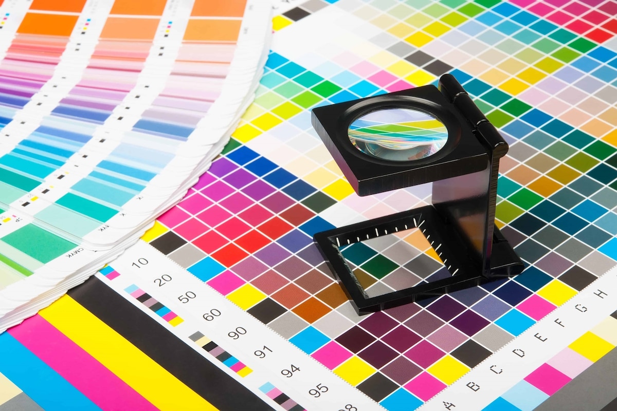
- Pantone Matching System — PMS assigns unique numbers to specific colors, creating a universal color language that designers, printers, and business owners can reference. This helps ensure that the shade of blue on your business card today matches the one used on your brochures, signage, and promotional products tomorrow.
- Color Calibration — At Brumley Printing, we ensure that our printers, monitors, and other equipment produce colors as accurately as possible. Without calibration, colors can drift over time due to equipment wear, environmental conditions, and normal production variations.
- Proofing Processes — Proofing is a quality-control step that helps identify potential issues before hundreds—or even thousands—of pieces are printed. We prefer for this to be a collaborative process between our clients and us.
- Consistent Production Standards — Professional printers follow established production standards to minimize variations between projects and ensure a more uniform final product.
In addition to working with a professional custom printing company, it is important for you, the client, to maintain brand color consistency in your everyday practices. This includes creating brand guidelines, working with one trusted printer versus farming materials out to multiple vendors, and reviewing proofs before they are printed.
Frequently Asked Questions (FAQs) About Branding Color Consistency
Brumley Printing Is Your Branding Color Consistency Guru
Consistent branding helps businesses make stronger first impressions and build long-term customer trust. Whether you’re printing business cards, brochures, direct mail, signage, or promotional materials, maintaining accurate brand colors is essential. At Brumley Printing, we help Fort Worth businesses achieve professional, consistent printing results that support their brand and marketing goals.
When you choose Brumley Printing as your print provider, you can be assured of high quality and great value. We offer a range of methods to meet your project’s unique needs and demands. Plus, we offer unprecedented service and guidance to every client. The collaborative effort with our customers provides invaluable peace of mind every step of the way.
Brumley Printing has been helping Fort Worth small businesses with their custom printing and marketing needs for over 30 years. To get started, call us at (817) 336-5551.
"*" indicates required fields
*Customer names and/or photos may be changed to protect privacy.